

 Hi,
Hi, 











Data Visualization with Excel and Cognos Dashboards

Enrollment is Closed

Course

Data Visualization with Excel and Cognos Dashboards
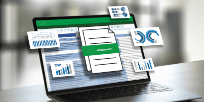
Master data visualization with Excel and IBM Cognos Analytics. Create impactful dashboards and insights—no coding required!
Online Live Classes
Beginner Level
Mentor Support


Data visualization is one of the top five essential skills for data science, and professionals skilled in Excel and Cognos are highly sought after. This instructor-led course teaches you how to create impactful visualizations and interactive dashboards without coding.
In this course, you'll start with Excel and learn about chartsline, pie, barand advanced visuals like treemaps, scatter plots, histograms, filled maps, and sparklines. You'll also explore PivotCharts and dashboard design.
As you progress, youll discover IBM Cognos Analytics, a powerful BI tool, to craft interactive dashboards that tell compelling data stories. Plus, youll build a portfolio of projects and gain hands-on experience in Excel and Cognos to showcase confidently in interviews.
Enroll today to boost your career!
This course comprises 4 purposely designed modules that take you on a carefully defined learning journey.
Our proven learning methodology blends the best that instructor-led training and self-paced learning have to offer. Leveraging the power of instructor feedback, mentor-supported hands-on practice, and additional home-based studying, you will build the deep technical and practical understanding todays employers are looking for.
Additionally, you will enjoy learning via an interactive online classroom environment where you will be able to participate and actively engage with your peers, instructors, and mentors. Plus, you will get the opportunity to earn recognized certifications which will help your resume and LinkedIn profile stand out.
The materials for each module are accessible from the start of the course and will remain available foWhat is the Visualizing Data with Excel Spreadsheets & Cognos Dashboards course about?r the duration of your enrollment. Methods of learning and assessment will include reading material, hands-on labs, and online exam questions.
As part of our mentoring service you will have access to valuable guidance and support throughout the course. We provide a dedicated discussion space where you can ask questions, chat with your peers, and resolve issues.
Once you have successfully completed the course, you will earn your Certificate of Completion.
By the end of this course, you will be able to:
- Create and customize basic charts in Excel such as line, bar, and pie charts to represent data effectively.
- Develop advanced Excel visualizations including treemaps, scatter plots, histograms, filled maps, and sparklines.
- Design and manage interactive Excel dashboards using PivotCharts and multiple visual elements.
- Build business intelligence dashboards in IBM Cognos Analytics to tell compelling, data-driven stories.
- Apply skills in a portfolio-ready project, showcasing practical expertise in visualization and dashboard design.
- Aspiring data analysts who want to gain essential visualization and dashboarding skills.
- Business professionals seeking to present data insights effectively using Excel and BI tools.
- Career starters or recent graduates aiming to build portfolio-ready projects to stand out in job applications.
- IT and data professionals looking to add Excel and Cognos Analytics expertise to their skillset.
- This is a beginner-friendly introduction to data analysis, therefore no prior programming experience is necessary. However, basic knowledge of using a computer, navigating files and folders, and using basic software applications is recommended.
Course Outline
Module Introduction
Excel Basics
Introduction to Charts
Creating Basic Charts in Excel (Line, Pie, and Bar Charts)
Using the Excel PivotChart Feature
Graded Quiz
Module Introduction
Creating Treemaps, Scatter Charts, and Histograms
Creating Filled Map Charts and Sparklines
Introduction to Dashboarding
Creating a Simple Dashboard using Excel
Graded Quiz
Module Introduction
Sample datasets used in the video
Cognos Analytics: Introduction and How to Sign Up
Navigating in Cognos Analytics
Creating a Simple Dashboard in Cognos
Advanced Capabilities in Cognos Analytics Dashboards
Graded Quiz
Final Project Overview
Final Quiz
Why Learn with SkillUp Online?
We believe every learner is an individual and every course is an opportunity to build job-ready skills. Through our human-centered approach to learning, we will empower you to fulfil your professional and personal goals and enjoy career success.

Reskilling into tech? We’ll support you.
Upskilling for promotion? We’ll help you.
Cross-skilling for your career? We’ll guide you.

Personalized Mentoring & Support
1-on-1 mentoring, live classes, webinars, weekly feedback, peer discussion, and much more.

Practical Experience
Hands-on labs and projects tackling real-world challenges. Great for your resumé and LinkedIn profile.

Best-in-Class Course Content
Designed by the industry for the industry so you can build job-ready skills.

Job-Ready Skills Focus
Competency building and global certifications employers are actively looking for.
FAQs
The Excel data visualization course helps you build practical skills to create clear, impactful data visuals using Excel and IBM Cognos Analyticswithout writing a single line of code. Youll learn to transform raw data into dashboards and stories that drive better decisions.
No, coding isnt required. This data visualization in Excel course is fully no-code and designed to give you hands-on experience using Excels built-in tools and Cognos Analytics for business intelligence.
Youll learn to create various charts in Excelfrom bar, line, and pie charts to advanced visuals like treemaps, histograms, and filled maps. The course also introduces Excel visual basic course concepts for automating simple tasks and explores how to build interactive dashboards using Cognos Analytics.
Yes. Youll gain skills in both Excel and Cognos. The Excel data visualization course takes you from spreadsheet-based visuals to interactive BI dashboards that connect multiple data sources.
This data visualization in Excel course takes about four weeks to complete, with flexible, self-paced learning supported by guided labs and a final project.
Youll learn to create foundational charts like bar, line, and pie charts, as well as advanced visualizations including treemaps, scatter plots, histograms, and sparklines. Youll also combine visuals into interactive dashboards.
Yes, youll learn how to use Excels PivotCharts and slicers to create dynamic dashboards that make data exploration simple and engaging.
Youll use IBM Cognos Analytics to build professional BI dashboards featuring interactive charts, maps, and reports that enhance data storytelling.
Absolutely. This Excel visual basic course is the best visualization training for beginners. You only need basic computer literacy and familiarity with spreadsheets.
Youll complete hands-on projects that involve building Excel dashboards and Cognos Analytics visualizations. By the end, youll have a portfolio that highlights your ability to analyze and present data visually.
Yes, once you complete the course, youll receive a Certificate of Completion that validates your skills in data visualization using Excel and Cognos.
Yes, the Excel data visualization course is self-paced, giving you the flexibility to learn whenever it fits your schedule
Completing this data visualization in Excel course can help you qualify for roles such as data analyst, business intelligence associate, reporting analyst, or visualization specialist.
This course uniquely combines Excel and Cognos Analytics in one curriculum, offering hands-on experience with both spreadsheet-based and BI-level visualization toolssomething few Excel visual basic courses provide.

Type of certificate
Certificate of Completion
About this course
04 Modules
05 Skills

Includes
Discussion Space
Hands-On Labs
Learning Material
04 Knowledge Checks
01 Final Quiz

Create
Excel Basic Visualization Project
Advanced Excel Dashboard
Cognos Analytics Dashboard

Exercises to explore
Creating basic Excel charts
Building advanced Excel visualizations
Designing Excel dashboards
Exploring Cognos Analytics
Newsletters & Updates
Subscribe to get the latest tech career trends, guidance, and tips in your inbox.